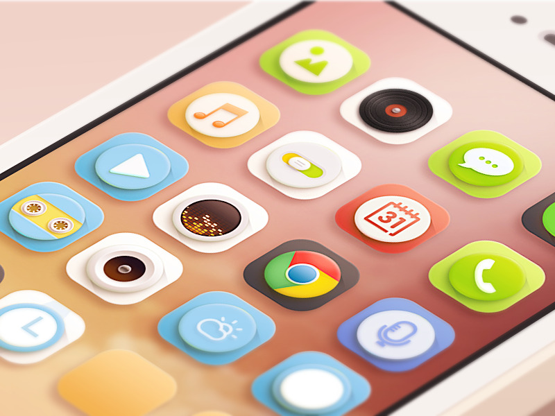
The overall key points that I read before consult Daniel, has noted down at bellow:
Skeuomorphism:
-Used in Apple, Iphone interace design
-Realistic looking
-Helps user quick understand icon significan
-3D, realistic
-Physical ornaments, an object mimic the form of real life object
-Implies connection to a past incarnation of similar design (Imitate real world materials)
-Visual Realism
Flat design ( Minimalism)
-Remove 3D, dropshadow, gradient effect (opposite of skeuomorphism)
-Simple color and design
-Basic, Albeit with more colors.
-Bright color palette.
-Typography is important.
-Icons and navigation items simplified and basic as long as user understand
-Illustration replace photographic treatmenst.
Why Skeumorphism trend change to flat design trend?
-Ease for designers and developers.
-Influence of typography.
-Flat design, care more typography, layout design, lead designers focus more on animation and interaction design
Problem with Skeunomorphism:
-"Uncanny valley" of user interface design
-Having limitation.
Therefore, I do more of the research and trace back the references that I found in the previous:
 |
| Image from : http://colleyportfolio.weebly.com/1/post/2013/10/skeuomorphism-vs-flat-design.html |
What is Skeuomorphism and Flat Design ?
Several websites sources that I found.
From theguardian.com, an article written by Steve Rose :
- Skeuomorphism means "making stuff look as if it is made of something else"
- skeuomorphism is all over Apple and other user interfaces – the little shadows cast by windows, the highlights on virtual buttons designed to make them look shiny, like real buttons.
From Shamihah.quora.com, an article written by Samihah Azim:
- Skeuomorph, is literally defined as, an object made to resemble another material or technique.
- Apple Human Interface Guidelines, and their overall software design philosophy, is filled with details from drop shadows, to gradients to make elements look more 3D and an overall focus on making objects appear more tactile (even if the medium is digital).
- Flat design champions clean design, and a focus on colors and typography.
From Sachagreif.com, an article written by Sacha greif:
- Author has cited from wikipedia as it defined Skeuomorph is a "physical ornament" or design on an object copied from a form of the object when made from another material or by other techniques.
From another article he wrote:
- A skeuomorph is “a derivative object that retains ornamental design cues to a structure that was necessary in the original“.
Resources : http://sachagreif.com/what-skeuomorphism-is-and-isnt/
Advantage of Skeuomorph:
From Sacha Grief noted :
- Helps tell apps apart (draw an impression for user as they might remember what the apps looks like, for example user might want to find "Setting", they remember the one with a realistic gear).
- Therefore, it makes apps more approachable
- Give Apple apps a distinctive style.
Disadvantage of Skeuomoprh:
From Sacha Grief noted :
- making something look like a physical object, but not work like it, also known as the "uncanny valley" of user interface design
Advantage of flat design :
- Flat design also forces you to really care about typography and layout
- flat design can make it easier to focus on animation and interaction design
- flat design is often purely visual, it does resonate with designer's love of minimalist concepts
From Brandbyname.com.au:
- Ease for designers and developers for web development with flat design.
- Useful when designing for responsive websites, images can be move around independently and still remain legible when device rotate to 90 degress, the design re-arranges to suilt.
Extra source about Skeuomorph : http://skeu.it/
Common feature of flat design:
From Brandbyname.com.au :
- A bright colour palette. There may be a retro feel to the colours, harking back to hyper-intense colours on original instagram photos.
- Solely black, grey and white colour palettes are used sparingly, and rarely alone.
- A mid-tone colour may use darker and lighter shades to introduce an element of 3D. Both black and white type or icons will read easily when placed over it.
- Typography is important. Type will stand out clearly over a flat background, so typefaces are chosen for their personality, easy readability and being legible at small sizes. This is most important in application design and across multiple platforms. In many cases the words will be the only navigation tool, so they need to work hard. Short words and phrases are useful.
- Icons and navigation items are simplified to their most basic, stripping out unnecessary elements – as long as a user understands what they mean, they have done their job.
- Illustrations replacing photographic treatments.
Skeuominimalism (combination of both world)
Flat design + drop shadow + gradient
 |
| Image from :http://inspirationmobile.tumblr.com/ |
Samihah Azim noted :
The focus on skeuominimalistic interfaces are on colors, shapes, and to an extent, typography. Shapes and colors are used to add dimension. The use of subtle drop-shadows are okay since it can create a level of dimension in design that's not over-the-top or tacky.
From Sacha Grief noted:
Seeking efficiency and simplicity without sacrificing usability to the altar of minimalism.
From Edwardsanchez.me:
I also found some research video that has done by Erin Lynch
Vimeo that relate on this topic:
Flat Design vs. Skeuomorphism (Limited Literature Review) from Erin Lynch on Vimeo.
Flat Design vs. Skeuomorphism (Limited Literature Review) from Erin Lynch on Vimeo.
Flat Design: Is It the Only Way Forward from Erin Lynch on Vimeo.
Some feedbacks and suggestion from Daniel after consultation:
Two ways to deal with this topic:
1. Trace "flat design" trend to Modern Art/ Design History
De style, Bauhaus....etc
2. Compare the arguments for or agasint flat design with Skeuomorphism